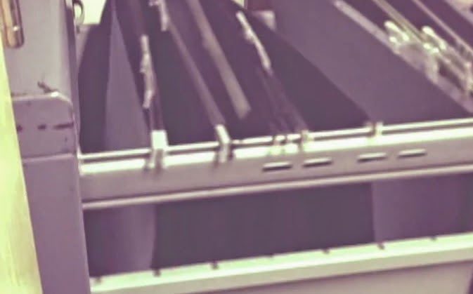
This Past student work is very clear with the title sequence. The use of the file cabinet is really effective because it makes us feel as they are stealing and searching through the files to reach the right one. We also see a effect over the top which is almost like fog. This looks like they want a blur effect, so people think its in the past. It gets the audience questioning the whole thing however this is a key convention for thrillers, having people question the story.
I also think at the end when the antagonist rips the piece of paper from the cabinet makes the audience feel tense because its like they can't find what they want.
They also don't use any bright colours. Apart from the yellow on the wall and the lighting on the note pad. Its very dull and dark which is a key convention for thrillers.
However i feel that the title sequence could be improved as its clear but needs something added to it to make it more exciting.


No comments:
Post a Comment