The first example in this article are two
versions of batman: 1960's TV version and Christopher Nolan's, The Dark knight
rises (2012). The difference between how mise en scene is used in these two
versions clearly depicts the sophistication of each. The TV series has the
characters wearing bright, 'garnish and cartoonish' colours. Where as in The
Dark Knight Rises the location looks more realistic and the colours are a lot
more dark to reflect the tone of the scene. These differences allow the
audience to establish what mood they should be feeling whether it is 'light
hearted ' or something more 'serious'.
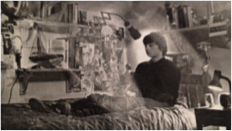
The second example is Submarine (2010).
From the very begging of the film the audience are shows subtle indications to
Oliver's personality. This scene is showing that the background of a shot is
extremely important to manipulate the audiences views, as Oliver's personality
was clearly complex from the items which he possessed. Firstly he had toys
which indicated he was quite young, but also had lots of very large books and
scientific items to suggest his intelligence was above just a child. The
costumes within Submarine also play a key role, His duffle coat (associated
with nerds) was always worn and allows the audience to understand his
character. The costumes of his parents are also very important, they wear very
ragged and run down clothes. This implies how Oliver thinks of his parents, and
therefore costume also establishes relationships.
The article also summarises and gives inspiration
of how to successfully use mise-en-scene in our own film. It suggests we are
creative with locations and consider any relatives or friends who may work
somewhere interesting. The locations in our film do not necessarily reflect
this, this is due to it being about a normal boy who is supposedly living a
normal life. Therefore I feel it would
be inappropriate to shoot in an un-ordinary location.
Secondly the article talks about the scenery and
how we should carefully consider what is in the background. We have done this
within our film, for example in the bedroom scene I have re-arranged furniture
to make the space more 'filmable' while also removing any items which don't
suit Freddie's personality. We will also have hints of his life as there will
be boxes of stolen items and a messy room to show he is not sane.
Thirdly when the article mentions costumes it
suggests we should not just be 'wearing the clothes we happened to be in at the
time' but actually consider how our outfit would reflect the characters
personality. We have carefully considered this aspect. For example Freddie
(played by Tom) will be wearing a mixture of black (associated with evil and
darkness) and white (associated with innocence). This will make it unclear to
the audience whether he is an antagonist or protagonist and therefore
confuse/intrigue the audience which are key conventions of thriller films.
Friend one and two (the supportive friends) will be wearing white, to establish
that they are good) where as friend three will be wearing black to show her as
cruel and un supportive. Finally Enzo's makeup has been carefully planned and
practised many times on our blog - she will look very run down, skinny and tired.
Her hair will be very messy and big to show her insanity. Finally her costume
will be all black to show that she is the antagonist.
According to the article the props we place with
each character will 'develop' them and 'provide visual interest'. We have
included items such as phones as their are associated with our target audience
and will therefore engage them as they will feel they have similarities with
the characters. We have also included a (fake) gun to add some excitement to
the opening. Gun scenes are typical of thrillers are created suspense and
tension which will engage the audience.


No comments:
Post a Comment